
Images are not just decoration in long-form content, they are structural elements that influence readability, SEO performance, user engagement and even conversions.
Yet most bloggers still treat image placement as an afterthought: they write the article first, then “drop in a few pictures” wherever they feel like it.
That approach leaves a lot of SEO value on the table.
In long-form blog posts especially (2,000–5,000+ words), image placement becomes part of your content architecture.
Done right, it guides the reader, breaks cognitive fatigue, reinforces key ideas and improves time-on-page.
Done poorly, it disrupts flow, confuses readers and can even slow down your page without adding value.
In this post, we’ll go beyond basic “add images to your blog” advice. You’ll learn exactly how to strategically place images in long-form blog posts so they improve SEO, readability and user experience, all at the same time.
Why Image Placement Matters More Than You Think
Most bloggers assume that as long as they include images in their posts, they’ve “done image SEO.” But search engines and readers don’t just care about whether images exist, they care about where those images are placed and how they function within the content.
In long-form blog posts, readers don’t consume content in a straight line. They scan, pause, scroll back and jump ahead.
Images act as visual anchors that help them navigate the content mentally.
From an SEO perspective, Google also evaluates how images contribute to user experience. If images are poorly placed, clumped together, irrelevant to surrounding text, or too sparse, they can negatively affect engagement signals like bounce rate and time on page.
Think of image placement as an element to storytelling.
Every image should either:
Explain something visually
Break up dense information
Reinforce a key point Improve readability flow When images are strategically placed, they act like “visual breathing points” in long blog posts.
Without them, even great content can feel overwhelming.
This post will show you how to turn images into a structural advantage instead of a random design choice.
Understanding the Role of Images in Long-Form Content
Before you can master image placement, you need to understand what images actually do in long-form content.
In short-form content, images are optional enhancements. In long-form content, they are essential navigation tools.
When a reader opens a 3,000-word blog post, they are subconsciously looking for patterns.
Walls of text create cognitive load, which leads to fatigue.
Images break that pattern and reset attention.
From a UX (user experience) perspective, images serve four major roles:
First, they improve comprehension.
Complex ideas become easier to understand when paired with visuals.
For example, a step-by-step guide becomes importantly clearer when screenshots or diagrams are included at each stage.
Second, they improve retention.
Studies consistently show that people remember visual information better than text alone. This is especially important in educational or tutorial- style blog posts.
Third, they improve scanning behavior.
Most readers don’t read every word, they scan headings, subheadings, and visuals.
Images act as visual checkpoints that help them decide whether to continue reading.
Fourth, they influence emotional engagement.
A well-placed image can make content feel more human, relatable, and less intimidating.
From an SEO standpoint, these UX improvements matter because they increase engagement signals like dwell time and scroll depth.
Google interprets these signals as indicators of content quality.
So image placement isn’t just about aesthetics, it’s about guiding behavior.
The Ideal Image-to-Text Ratio for SEO
One of the most common mistakes bloggers make is either using too few images or overwhelming their content with too many.
There is no strict “Google rule” for image-to-text ratio, but there are proven UX patterns that consistently perform better.
For long-form content, a good baseline is:
1 image every 300–500 words At minimum,
1 image per major section
More images for tutorial or how-to content However, the real principle is not quantity, it’s purpose per image.
Each image should earn its place. If you remove it and the blog post still makes sense, it might not be necessary.
In informational blog posts, fewer but more meaningful images often perform better than excessive visuals. In contrast, tutorial or step-by-step guides often require more frequent images to maintain clarity.
Another important factor is spacing. Images should not be clustered too closely together. When multiple images appear back-to-back, they can disrupt reading flow and feel overwhelming, especially on mobile devices.
On the other hand, long sections of text without any visual breaks can cause reader fatigue and increase bounce rates.
The goal is balance: a rhythm between text and visuals that feels natural.
Think of it like pacing in a conversation. Too many interruptions feel chaotic.
Too few feel exhausting. Proper image distribution creates a smooth reading experience that keeps users engaged longer.
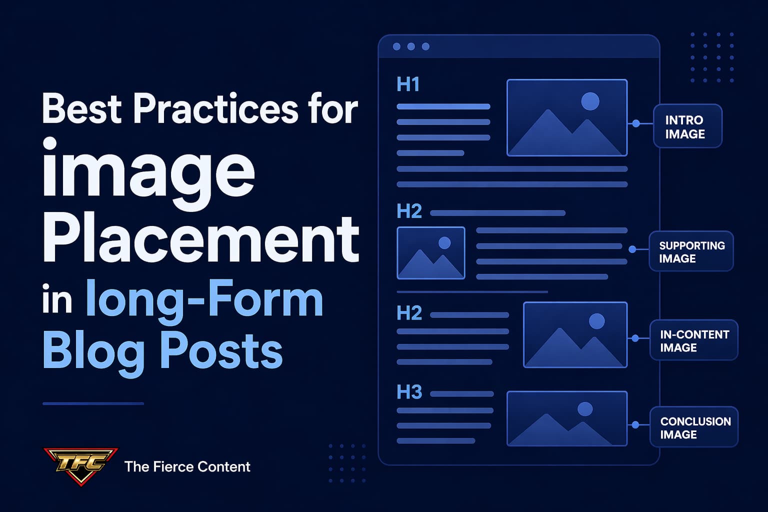
Strategic Image Placement Within blog post Structure
The structure of your blog post should guide where images go, not the other way around.
A well-structured long-form blog post typically includes:
Introduction
Main sections (H2 headings)
Subsections (H3 headings)
Conclusion
Each of these sections has different image needs.
Introduction Placement
The introduction is where you set expectations and capture attention.
A strong featured image placed near the top helps establish context and improves first impressions.
However, avoid pushing content too far down the page, users still want to see text immediately.
After Major Headings
One of the most effective SEO practices is placing images immediately after H2 sections. This reinforces the topic visually right after the heading is introduced.
For example, if your H2 is “How to Optimize Blog Images,” placing a relevant image right after it helps anchor the concept in the reader’s mind.
Within Step-by-Step Sections In instructional content, images should follow each step or group of steps.
This creates a natural learning flow:
Step by step explanation
Visual confirmation
This pattern reduces confusion and increases completion rates.
Before Key Takeaways
Placing an image before an important insight can act as a visual cue that something valuable is coming.
This improves attention and retention.
In the Conclusion, While not always necessary, a concluding image can reinforce the overall message and leave a lasting visual impression.
The key principle is alignment: images should always support the structure, not interrupt it.
Mobile-First Image Placement Strategy
More than half of web traffic comes from mobile devices, which completely changes how image placement should be approached.
On mobile, screen space is limited.
What looks well-spaced on desktop can feel overwhelming on a phone if images are not carefully distributed.
One of the most important mobile principles is vertical pacing.
Images should be spaced far enough apart to avoid “visual stacking,” where multiple images push text too far down the screen.
Another key factor is scroll fatigue.
Mobile users scroll quickly, so images should act as “rest points” that slow them down and re-engage attention.
However, too many images being too close together can have the opposite effect, they encourage rapid scrolling without reading.
You should also consider image width.
Full-width images often work best on mobile because they maintain consistency and reduce layout disruption.
Another overlooked issue is loading speed.
Poorly optimized images placed at the top of the page can delay initial rendering, hurting both SEO and user experience.
This is why lazy loading becomes essential, it ensures images further down the page don’t slow initial load times.
Mobile-first image placement is ultimately about restraint and clarity.
Every image should have enough space to breathe and enough purpose to justify its presence on a small screen.
SEO Considerations for Image Placement
Image placement directly influences SEO performance, even if indirectly.
Search engines don’t just analyze images individually, they analyze how images interact with surrounding content.
One key factor is contextual relevance.
Images placed near relevant text help reinforce topic understanding.
For example, placing a “keyword research tool screenshot” inside a section about SEO tools strengthens topical relevance.
Another factor is content hierarchy.
Properly placed images help Google understand which sections are more important based on engagement patterns.
Image placement also affects dwell time.
Well-placed visuals encourage users to stay longer on the page, which is a positive ranking signal.
However, poor placement can have the opposite effect.
If images interrupt reading flow or feel irrelevant, users may leave early, increasing bounce rates.
Captions also play a subtle SEO role. When used correctly, they provide additional context that both users and search engines can interpret.
Finally, placement affects crawl behavior. While Google can understand images, it still relies heavily on surrounding text and structure to interpret meaning.
In short, image placement is not just UX, it is an SEO signal amplifier.
Common Mistakes in Image Placement (and How to Fix Them)
Even experienced bloggers make image placement mistakes that hurt performance.
One of the biggest mistakes is clustering images together. When multiple images appear in a row, they break reading flow and reduce content engagement.
Another mistake is placing images randomly without context. If an image doesn’t clearly relate to the paragraph it sits in, it confuses readers instead of helping them.
Some bloggers also make the mistake of overusing decorative images. While aesthetics matter, too many unrelated visuals dilute focus and reduce content authority.
Another issue is ignoring heading alignment.
Images should support sections, not float between unrelated ideas.
Then there’s the mistake of placing all images at the bottom of the blog post. This creates imbalance and weakens engagement throughout the content.
Finally, many bloggers fail to test their image placement on mobile devices. What looks fine on desktop often becomes chaotic on smaller screens.
Fixing these issues requires one mindset shift:
stop thinking of images as decoration and start thinking of them as structural elements of communication.
Advanced Image Placement Strategy for High- Performing Blogs
Once you’ve mastered the basics, you can move into advanced strategies that drastically improve engagement and SEO performance.
One powerful approach is narrative image flow, placing images in a way that tells a visual story alongside the text.
Another strategy is progressive disclosure, where images gradually reveal complexity as the reader moves deeper into the blog post.
You can also use “attention resets,” where an image is placed after dense paragraphs to re-engage reader focus.
In high-performing blogs, images are also used to reinforce emotional pacing.
For example, educational sections may use diagrams, while motivational sections use aspirational visuals.
Another advanced technique is intent matching.
Different sections of yourblog post serve different reader intents and your images should reflect that:
Informational sections → diagrams, charts Tutorial sections → screenshots Conceptual sections → illustrations
This alignment dramatically improves comprehension and engagement.
The most successful blogs don’t just use images, they choreograph them.
Conclusion:
Image Placement Is a Strategic SEO Skill, Not a Design Choice If you take one thing away from this post, let it be this:
Image placement is not random.
It is a deliberate SEO and UX strategy that directly impacts how your content performs.
When images are placed thoughtfully, they:
Improve readability
Increase engagement
Reduce bounce rates
Strengthen SEO signals
Enhance user experience
When they are placed poorly, they do the opposite, no matter how beautiful the images are.
The best bloggers in 2026 are not just writing great content. They are designing reading experiences. And images are a core part of that design.
If you start treating image placement as a structural element and not an afterthought, you’ll immediately see improvements in how users interact with your content and how search engines rank it.
Great content informs.
Great structure retains.
Great image placement does both.