
In today’s digital world, people browse websites on their phones more than ever before.
Whether someone is shopping online, reading a blog, watching tutorials, or searching for local businesses, there’s a very high chance they are doing it from a smartphone.
That single shift in user behavior has completely changed how websites should be designed.
If your WordPress website isn’t mobile-friendly, visitors will quickly leave. They won’t wait for slow pages to load, struggle to read tiny text, or deal with broken layouts. Modern users expect websites to work perfectly on every device.
They want fast loading speeds, clean navigation, responsive layouts, and effortless browsing experiences.
This is where mobile-friendly WordPress themes become incredibly important.
A good mobile-responsive theme does far more than simply “fit” onto a smaller screen.
It improves the entire user experience.
It makes navigation easier, content more readable, pages faster, and interactions smoother.
Most importantly, it helps keep visitors engaged for longer periods of time.
Google also prioritizes mobile usability when ranking websites. Since Google uses mobile- first indexing, your site’s mobile experience directly affects your SEO performance.
Choosing the right mobile-friendly WordPress theme can therefore improve both your user experience and your search engine visibility.
The challenge is that there are thousands of WordPress themes available online. Some look beautiful but perform poorly on mobile devices.
Others load quickly but lack customization features. Some are overloaded with animations and unnecessary design elements that slow down the browsing experience.
That’s why choosing the right theme matters.
In this in-depth guide, you’ll learn:
Why mobile-friendly themes matter
How responsive themes improve user experience
Essential features to look for
The best types of mobile-responsive themes
Common mistakes to avoid
How mobile optimization improves SEO
Tips for maximizing performance after installation
By the end of this article, you’ll understand exactly how to choose a WordPress theme that not only looks professional but also delivers an exceptional experience for your visitors on every screen size.
Why Mobile-Friendly WordPress Themes Matter More Than Ever
The internet has become mobile-first.
Years ago, websites were designed primarily for desktop users. Mobile browsing was considered secondary.
Today, the opposite is true.
Millions of people rely on smartphones as their main internet device. They search for information during lunch breaks, shop while commuting, scroll through blogs before bed, and interact with brands entirely from mobile devices.
If your website doesn’t provide a smooth mobile experience, users will leave within seconds.
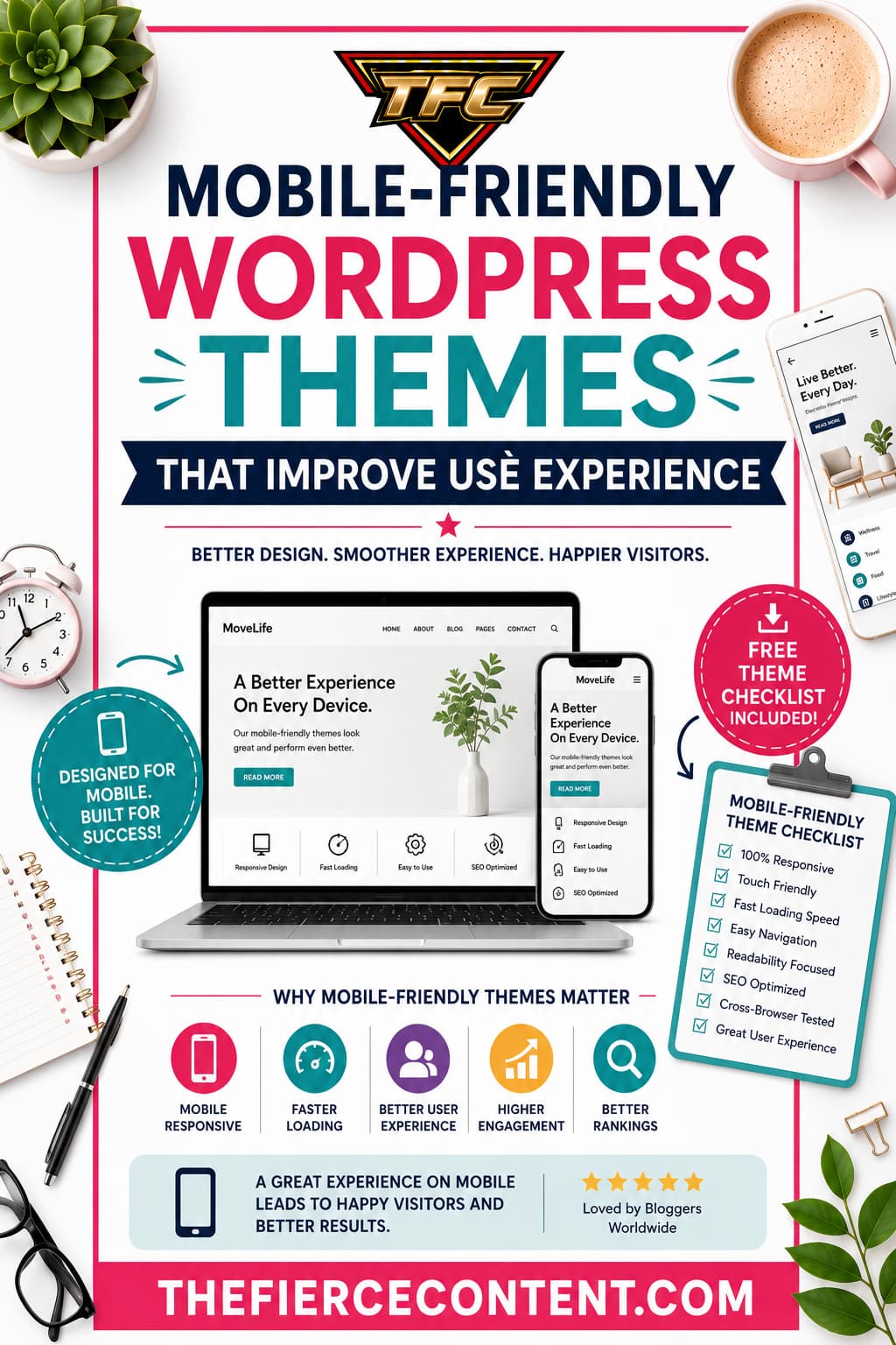
A mobile-friendly WordPress theme automatically adapts your website layout to different screen sizes. This means your content, images, menus, buttons, and typography adjust beautifully whether someone is using a phone, tablet, laptop, or desktop computer.
But the importance goes far beyond aesthetics.
Mobile-friendly themes improve:
Readability
Navigation
Loading speed
User engagement
Accessibility
SEO rankings
Conversion rates
Bounce rates
Imagine a visitor opening your website on their phone and immediately struggling to zoom in, tap buttons, or scroll properly.
Frustration builds instantly. Most users won’t give your website a second chance.
On the other hand, when visitors land on a responsive, smooth, fast-loading website, they feel comfortable exploring further. They trust the site more. They stay longer. They are more likely to subscribe, purchase, or share your content.
Google has repeatedly emphasized mobile usability as a ranking factor. Websites that provide excellent mobile experiences tend to perform better in search results. Since mobile-first indexing became standard, Google primarily evaluates the mobile version of websites for ranking purposes.
This means your desktop design alone is no longer enough.
Additionally, mobile-friendly themes improve accessibility for people with disabilities. Better spacing, responsive layouts, readable fonts, and touch-friendly navigation make websites easier for everyone to use.
Business owners, bloggers, affiliate marketers, online stores, freelancers, agencies, and creators all benefit from mobile optimization because user experience directly affects results.
Even the most amazing content can fail if the website experience feels frustrating on mobile devices.
That’s why selecting the right responsive WordPress theme is no longer optional. It’s one of the most important decisions you’ll make for your website’s long-term success.
What Makes a WordPress Theme Truly Mobile-Friendly?
Many WordPress themes claim to be responsive, but not all mobile-friendly themes are created equally. Some technically resize content for smaller screens while still offering poor usability. Others genuinely optimize every aspect of the browsing experience.
A truly mobile-friendly WordPress theme focuses on functionality, speed, readability, and user interaction across all devices.
One of the most important features is responsive design. Responsive themes automatically adapt layouts based on screen size. Columns rearrange themselves, images resize properly, and navigation becomes easier to use on smaller devices.
Another critical factor is touch-friendly navigation. Mobile users rely on tapping rather than clicking. Buttons need enough spacing so users don’t accidentally tap the wrong links. Menus should be simple, organized, and easy to open on smartphones.
Typography also plays a major role in user experience. Small fonts frustrate mobile readers. High-quality themes use scalable typography that adjusts for readability across different devices.
Fast loading speed is equally essential. Mobile users often browse using slower internet connections. Heavy themes with oversized images, unnecessary animations, bloated code, and excessive scripts can dramatically slow down websites.
Good mobile-friendly themes are optimized for performance by:
Using lightweight code Reducing unnecessary scripts Supporting image optimization Minimizing CSS and JavaScript Working well with caching plugins Compatibility matters too. A quality responsive theme should work smoothly with: SEO plugins Page builders WooCommerce Mobile optimization tools Contact forms Caching plugins Security plugins
Another important feature is mobile-friendly media handling. Videos, sliders, galleries, and featured images should resize correctly without breaking layouts or slowing down pages.
A truly user-focused theme also prioritizes accessibility. This includes:
Proper color contrast Keyboard navigation support Readable fonts
Screen-reader compatibility Clear spacing Logical structure Themes that overload mobile layouts with popups, excessive ads, animations, or complicated menus create frustrating user experiences.
Minimalism often works better for mobile design because simplicity improves usability.
It’s also important to understand that mobile optimization is not only about design. It’s about psychology. Mobile users behave differently from desktop users. They scan faster, expect quicker results, and have shorter attention spans.
The best mobile-friendly WordPress themes understand this behavior and create smoother, more intuitive browsing experiences that guide users naturally through the site.
When evaluating themes, always test demos on your phone. What looks amazing on desktop may feel cluttered and frustrating on mobile devices.
A beautiful website that performs poorly on smartphones can silently damage your traffic, SEO, and conversions without you even realizing it.
How Mobile-Friendly Themes Improve User Experience User experience is one of the biggest factors influencing whether visitors stay on your website or leave immediately.
A mobile-friendly WordPress theme directly shapes how users feel when interacting with your content.
Great user experience feels effortless.
Visitors should never have to struggle to:
Read text
Find information
Navigate menus
Click buttons
Watch videos
Fill forms
Complete purchases
Responsive WordPress themes improve usability by removing friction from the browsing experience.
One major improvement comes from readability. Mobile-friendly themes automatically adjust font sizes, line spacing, and content width to fit smaller screens. This prevents users from zooming in repeatedly just to read articles.
Another important factor is navigation simplicity. On mobile devices, space is limited. Good themes use clean mobile menus, collapsible navigation, sticky headers, and intuitive layouts that help users find information quickly.
Loading speed significantly affects user experience as well. Studies consistently show that users abandon slow websites rapidly.
A lightweight, optimized theme creates faster page loads, smoother scrolling, and better performance overall.
Visual consistency also matters. Responsive themes ensure that images, videos, and content sections maintain proper alignment and formatting across devices. Broken layouts instantly make websites appear unprofessional.
Mobile-friendly themes also improve engagement metrics. When users feel comfortable navigating your website, they:
Visit more pages
Stay longer
Interact more
Share content
Return more often
For bloggers, this means lower bounce rates and better audience retention.
For online stores, it means improved conversions and sales.
For businesses, it means increased trust and credibility.
Another overlooked advantage is emotional comfort. Users subconsciously judge websites within seconds. A smooth, polished mobile experience creates positive first impressions that influence how trustworthy your brand appears.
Themes designed with mobile UX in mind often include:
Clear call-to-action buttons
Better spacing
Streamlined layouts
Faster interactions
Minimal distractions
These elements make browsing feel more enjoyable and less overwhelming.
Accessibility improvements are another huge benefit.
Responsive themes help users with different needs access content more easily. This creates a more inclusive web experience while also improving overall usability for everyone.
Search engines notice these engagement signals too. Better user experience often leads to:
Lower bounce rates
Higher dwell time
More page views
Better SEO rankings
In many ways, user experience and SEO are deeply connected.
At the end of the day, people don’t stay on websites simply because they look attractive. They stay because the experience feels smooth, useful, fast, and enjoyable.
That’s exactly what a high-quality mobile-friendly WordPress theme is designed to achieve.
Essential Features to Look for in Mobile-Friendly WordPress Themes
Choosing the right WordPress theme can feel overwhelming because there are so many options available. However, focusing on the right features helps simplify the decision- making process significantly.
The first feature to prioritize is responsive design. This is non-negotiable. Your theme should automatically adjust layouts for desktops, tablets, and smartphones without breaking the design or functionality.
Next, prioritize speed optimization. Fast themes improve both user experience and SEO performance. Lightweight themes with clean coding structures usually perform far better than visually overloaded designs.
Look for themes optimized for Core Web Vitals. These Google performance metrics measure:
Loading speed
Visual stability
Interactivity
Themes that perform well in these areas generally provide better user experiences.
Customization flexibility is also important. You want a theme that allows you to:
Adjust colors
Modify typography
Customize headers
Create layouts
Change spacing
Add widgets without needing advanced coding skills.
Page builder compatibility matters too. Many users rely on builders like:
Elementor
Gutenberg
Beaver Builder
Divi
Your theme should integrate smoothly with these tools.
SEO optimization is another essential feature. Good themes use clean HTML structure, schema markup support, proper heading hierarchy, and optimized code that search engines can easily understand.
Typography controls are often overlooked but extremely important. Good mobile themes allow readable fonts, proper spacing, and scalable text for different screen sizes.
WooCommerce compatibility is critical for online stores. A mobile-friendly eCommerce experience dramatically affects conversions. Product pages, checkout processes, and navigation should work smoothly on smartphones.
Accessibility support is another valuable feature. Look for themes that follow accessibility standards such as:
Keyboard navigation
Screen-reader support
Proper contrast ratios
Semantic HTML
Minimal plugin dependency is also beneficial. Themes requiring dozens of plugins often become slower and more unstable.
Security updates and developer support matter long-term as well.
Well-maintained themes receive updates that improve:
Security
Compatibility
Performance
Mobile optimization
Demo quality can reveal a lot about a theme’s usability. Always test demos on your phone before purchasing or installing a theme.
Look carefully at:
Menu usability
Button spacing
Text readability
Image scaling
Loading speed
Layout consistency
Another excellent feature is lazy loading support. This improves mobile performance by loading images only when needed rather than all at once.
Clean design simplicity often outperforms flashy animations and cluttered layouts. Mobile users value speed and usability more than excessive visual effects.
Ultimately, the best mobile-friendly WordPress themes balance beauty, functionality, speed, flexibility, and simplicity to create exceptional user experiences across every device.
Best Types of Mobile-Friendly WordPress Themes
Different websites require different types of themes. The best mobile-friendly theme for a personal blog may not work well for an online store or business website.
Understanding the main categories of responsive WordPress themes helps you choose the best fit for your goals.
Blogging Themes Mobile-friendly blogging themes focus heavily on readability and content presentation. These themes usually feature: Clean typography Minimal distractions Fast loading speeds Easy navigation Optimized article layouts Content-focused themes work exceptionally well because mobile readers value simplicity and smooth scrolling experiences.
Lifestyle bloggers, travel bloggers, food bloggers, and niche content creators benefit greatly from clean, responsive layouts that highlight written content and images beautifully.
Business Themes
Business websites need professional mobile experiences that build trust quickly. Responsive business themes typically include: Service sections Testimonials Contact forms Mobile call buttons Portfolio layouts Team pages
A mobile-friendly business website helps potential customers access information quickly and contact you easily from their phones.
eCommerce Themes
Online shopping on mobile devices continues growing rapidly. WooCommerce themes designed for mobile responsiveness are essential for: Product browsing
Cart functionality
Checkout processes
Product galleries
Payment integration
A poor mobile shopping experience can destroy sales conversions.
Good eCommerce themes prioritize:
Fast checkout
Easy product filtering
Mobile-friendly product pages
Optimized image handling
Portfolio Themes
Creative professionals such as photographers, designers, and artists need visually appealing mobile-responsive portfolio themes.
These themes emphasize:
Image galleries
Responsive grids
Smooth transitions
Visual storytelling
Full-screen media
Since portfolios are highly visual, mobile optimization is especially important.
Magazine Themes
News and magazine-style websites publish large amounts of content regularly.
Mobile- friendly magazine themes help organize information clearly while maintaining fast performance.
Good magazine themes include:
Category organization
Responsive article grids
Ad optimization
Featured post sections
Scannable layouts
Minimalist Themes
Minimalist themes are often among the best choices for mobile optimization because simplicity naturally improves usability.
These themes reduce distractions by focusing on:
White space
Readability
Speed
Clean layouts
Easy navigation
Minimalist themes tend to perform exceptionally well for SEO and user experience.
Choosing the right category depends on your audience, goals, and content strategy. The best theme is not necessarily the most visually impressive. It’s the one that creates the smoothest experience for your visitors.
How Mobile-Friendly Themes Improve SEO Rankings
Search engine optimization and mobile usability are closely connected. Google wants users to have positive browsing experiences, so websites optimized for mobile devices often perform better in search rankings.
Google officially uses mobile-first indexing. This means the search engine primarily evaluates your website’s mobile version when determining rankings.
If your site performs poorly on smartphones, your SEO performance can suffer significantly.
Mobile-friendly WordPress themes improve SEO in several important ways.
The first is speed optimization. Fast-loading websites rank better because page speed affects user experience directly.
Lightweight responsive themes usually improve:
Page load time
Server response efficiency
Core Web Vitals
Mobile performance metrics
Responsive design also prevents duplicate content issues. Instead of creating separate desktop and mobile websites, responsive themes use one adaptable layout across all devices.
This simplifies SEO management while improving crawl efficiency.
User engagement metrics also affect rankings indirectly.
Mobile-friendly websites often produce:
Lower bounce rates
Higher session durations
More page views
Better interaction rates
These positive behavioral signals indicate quality to search engines.
Proper mobile usability reduces frustration, which keeps visitors engaged longer.
Clean coding structures help search engines understand your content better too. Well- coded themes improve:
HTML structure
Heading hierarchy
Schema compatibility
Crawlability
Responsive themes also improve accessibility, which contributes to better usability overall.
Another major advantage is image optimization compatibility. Mobile-friendly themes usually support responsive images that scale appropriately for different screen sizes, improving loading speed without sacrificing quality.
Google’s Core Web Vitals place strong emphasis on:
Largest Contentful Paint (LCP)
Interaction responsiveness
Visual stability
Many modern responsive themes are built specifically to perform well in these areas.
SEO-friendly mobile themes also help with local search optimization. Many mobile users search for nearby businesses, services, and products directly from their phones.
A responsive, fast-loading site improves:
Mobile visibility
Local SEO Conversion potential
Even social sharing performs better when your website is mobile optimized because most social media users browse from smartphones.
Ultimately, SEO is no longer only about keywords and backlinks. User experience has become a major ranking factor.
That’s why choosing a high-quality mobile-friendly WordPress theme is one of the smartest long-term SEO investments you can make.
Common Mistakes to Avoid When Choosing Mobile- Friendly Themes
Many website owners unintentionally choose themes that look visually impressive but create frustrating mobile experiences.
One common mistake is prioritizing appearance over performance. Heavy animations, oversized sliders, excessive effects, and cluttered layouts often slow down websites dramatically on mobile devices.
Beautiful design should never come at the expense of usability.
Another mistake is ignoring demo testing. Always test theme demos directly on your phone before installing them. Desktop previews alone cannot accurately reveal mobile usability problems.
Some themes appear responsive but still suffer from:
Tiny fonts
Poor button spacing
Broken layouts
Difficult navigation
Slow loading speed
Overusing plugins is another major issue.
Even a good mobile-friendly theme can become slow if overloaded with unnecessary plugins.
Many users also ignore image optimization. Large images significantly slow down mobile performance. A responsive theme works best when combined with properly compressed images.
Choosing poorly supported themes is risky too. Themes without regular updates may eventually become incompatible with WordPress updates, plugins, or modern mobile standards.
Another mistake is neglecting typography. Fancy fonts may look attractive but become difficult to read on small screens.
Ignoring accessibility also harms usability. Websites should work comfortably for all users, including those with disabilities.
Some site owners clutter mobile layouts with:
Too many popups
Excessive ads
Autoplay videos
Intrusive banners
These elements frustrate users and increase bounce rates.
Another mistake is failing to optimize navigation. Complicated menus confuse mobile visitors quickly.
Simple, intuitive mobile navigation improves engagement significantly .
Finally, many people fail to prioritize speed testing after theme installation. Even responsive themes need optimization.
Always test your website using tools like:
Google PageSpeed
Insights GTmetrix
Lighthouse
Choosing a mobile-friendly WordPress theme is only the beginning. Continuous optimization is what creates outstanding user experiences long-term.
Key Takeaways on Mobile-Friendly WordPress Themes
Mobile-friendly WordPress themes are no longer optional in modern website design. They are essential for user experience, SEO success, engagement, and long-term growth.
Today’s internet users expect websites to load quickly, display beautifully, and function smoothly across every device.
A frustrating mobile experience can instantly drive visitors away, regardless of how valuable your content may be.
The right responsive theme improves:
Readability
Navigation
Speed
Accessibility
SEO performance
Conversion rates
User trust
It creates a browsing experience that feels effortless and enjoyable.
Whether you run a blog, online store, business website, portfolio, or magazine site, mobile optimization directly affects your success.
When selecting a WordPress theme, focus on:
Speed
Simplicity
Responsiveness
Accessibility
SEO optimization
Usability
Avoid themes overloaded with unnecessary visual effects that slow down performance and complicate navigation.
Remember that user experience is about helping visitors accomplish their goals quickly and comfortably.
A fast, clean, mobile-friendly website keeps users engaged, improves search rankings, and creates stronger connections with your audience.
In the competitive digital landscape, even small usability improvements can make a major difference. Choosing the right mobile-responsive WordPress theme is one of the smartest investments you can make for your website’s future growth and success.